I’m in my last semester of school, I am taking a course about color theory. While it is proving to be very challenging and more time consuming (and not to mention expensive) than I expected, it’s one of the only classes that I wish I would have had earlier in my education. I think this topic is immensely valuable and I can see a lot of growth in myself and I’m only half way through the course. I can imagine how the topic could be applied to any creative or artistic practice.
We have been studying Josef Albers, Interaction of Color. I bought the book but later learned there is an app for the Ipad that allows you to work through the assignments digitally – which has really helped me further understand what we are studying. I imagined this would be about what colors mean, somewhat of a color psychology but it is truly understanding how colors interact and what they can do to one another when you play with hue, intensity and value. And then leveraging that knowledge to create specific optical illusions. We began the course with paper and testing out each chapter with colored pieces of paper. I now have so much colored paper left that everyone is going to be getting handmade cards for the rest of my life!
We recently moved on to paint. This is where things have become really expensive but also I’m a little more in control and able to manipulate colors together more so than when I was restricted to what paper color I could find. We’re creating colors from a very simple pallet of pigments and it’s really interesting to see how much can be made. Each week we work on a series of chips that show the range of hues from one color to the next. We pair that with a 20″ x 20″ composition that allows us to apply what we understand with color to make a mood, define space, etc.
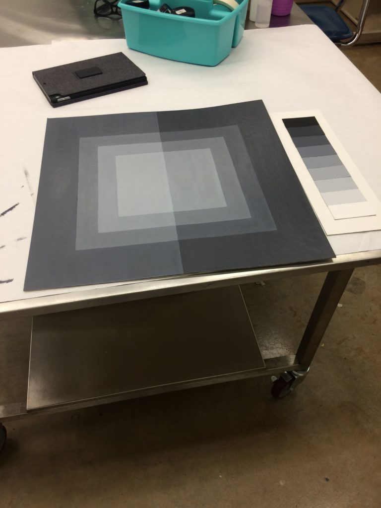
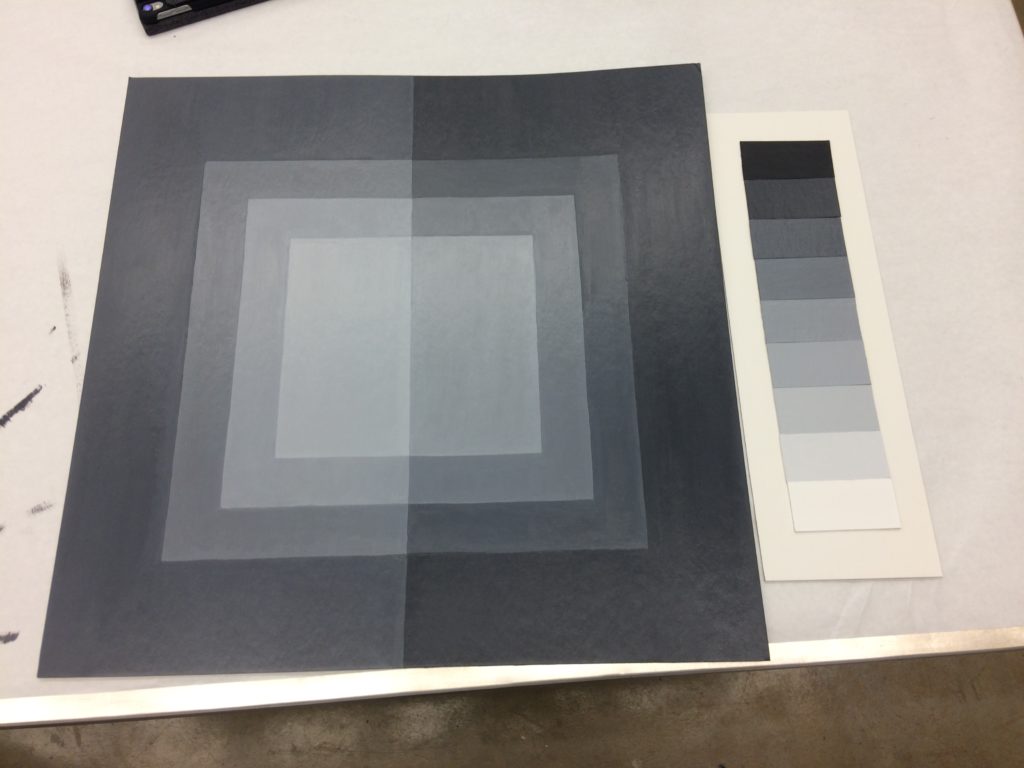
The first paint assignment was in grayscale. I found that I was caught up in the design of my composition (go figure!) and have been challenging myself to pull back and keep my designs and compositions very simplified so I can focus on just understanding color. In the image above you can see my final version. I wanted to play with mood and to see how much of a shift could happen if you stepped your color down only one shade. On the left there is a light rectangle on top and then the next color is the exact same as the top rectangle on the right. During our critique, my classmates commented how it felt like the lights were off on one side of the page and there was a very clear divide. I had to physically show which colors were the same because they didn’t believe or see it until I physically pointed it out. I think this was very successful and played more with mood than anything else, which was my original intent.
I struggled a lot in the first several weeks, which is not really like me and I found that when I simplified, things began to make more sense or I could grasp them a little more quickly. Some of my peers are creating very complex and beautiful designs and I think I’ll push myself to go a little further each time while really understanding the color task or idea at hand.




Leave a Reply