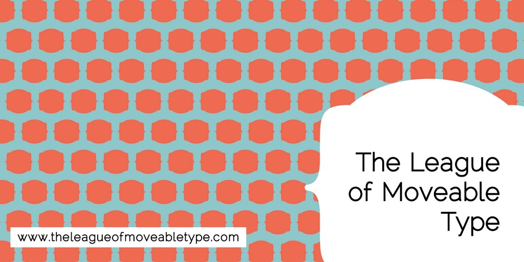
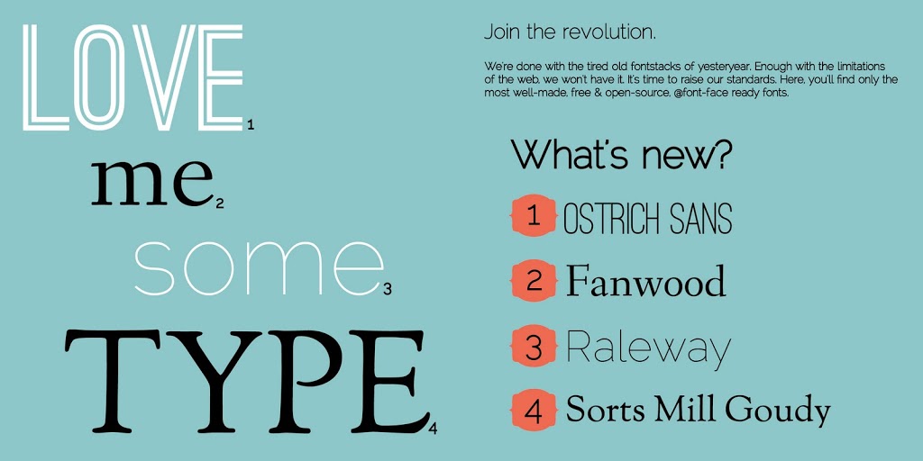
For my advanced typography class we have been assigned to design a type catalog featuring 3-6 typefaces from a type foundry of our choice. I am all about free fonts. I have a new respect for the amount of time and work that goes into designing a typeface and think the designer should be compensated – but don’t want it to necessarily be by me. So instead of trying to figure out a way to steal fonts I selected a foundry that offers all free typefaces, The League of Movable Type.
The catalog size has to fit in an 8.5 X 11 but we can pick any size as long as that requirement is met. Mine is designed at 5 x 5. We are currently in the Black & White Comps stage, which means we present these in black and white and receive feedback before changing colors. I usually play with color a little and then change it after the critique.
I like where this is heading. I am sure my teacher will need some convincing – he isn’t very easy to please or receive consistent feedback from.
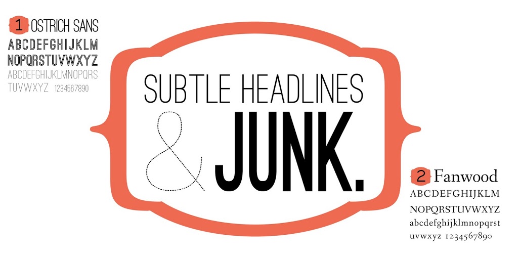
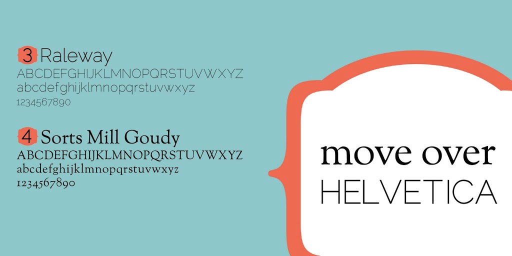
This has probably been my favorite assignment so far because I have an obsession with fonts and liked picking some for this project. I don’t think I have shared much of my school work and want to document better so I can see my progress!


Leave a Reply